

Gorilla FC
Gorilla FC was growing rapidly, and they had received complaints about their old website. The Gorilla FC founder wanted me to fix their usability issues, as well as attract new members to their organization. I worked closely with a team of designers to construct a new website for Gorilla FC to accommodate their growth.
Research
To get the ball rolling, we conducted organizational research. This included a preemptive content audit before we interviewed anyone. It was evident that the UI and navigation needed to improve. The most important flaw was that there was no visual hierarchy. Each navigational element held the same amount of visual bearing, so it took a tremendous amount of effort for the user to pinpoint how to proceed toward his intended goal. Besides that, the website's information architecture was very confusing. Even if the user knew what he was looking for, it was difficult to find it. The combination of these two elements made for a frustrating experience and also often sent their users to undesired locations on their website.
With these flaws in mind, we now needed to figure out what people actually wanted to do with this website. To find the most effective people to interview, we created two screener surveys. One survey was for current Gorilla FC members and the other one was for people who were interested in joining. The interview scripts for the prospective members were focused on what would make them want to join a fan-based organization. Interviews for the current members focused on how they used the website.
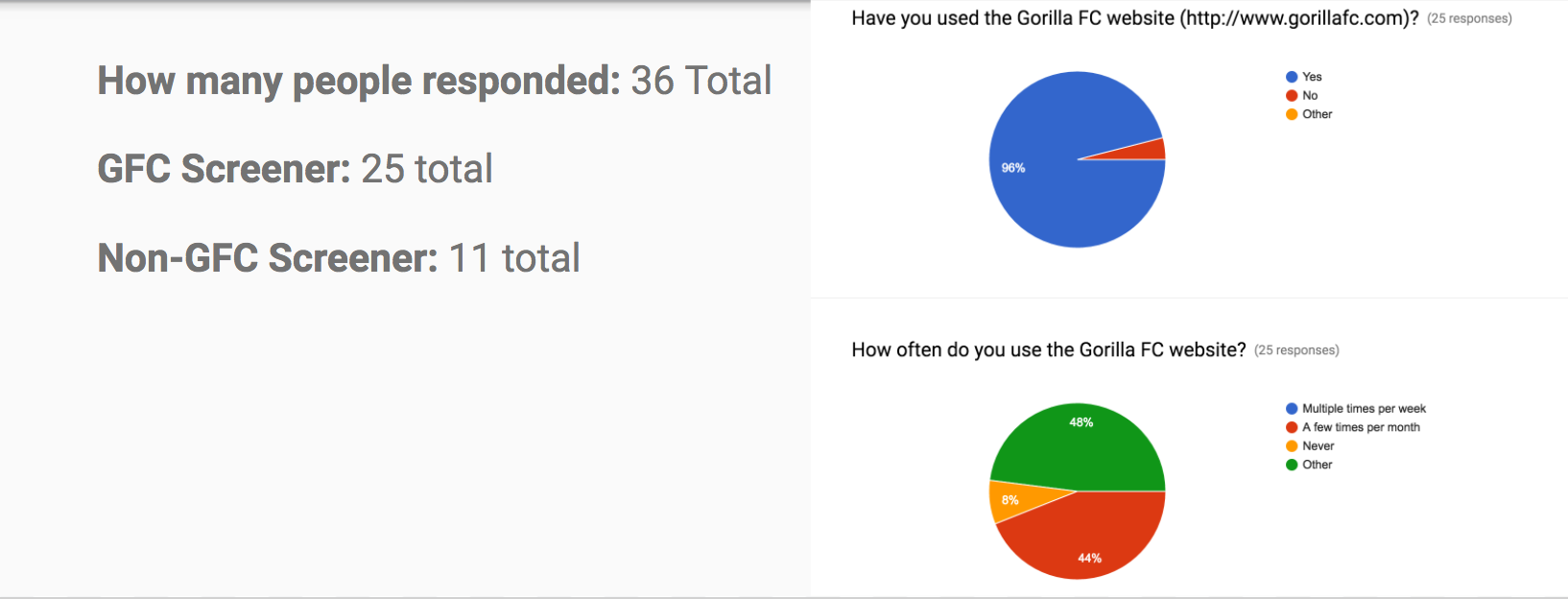
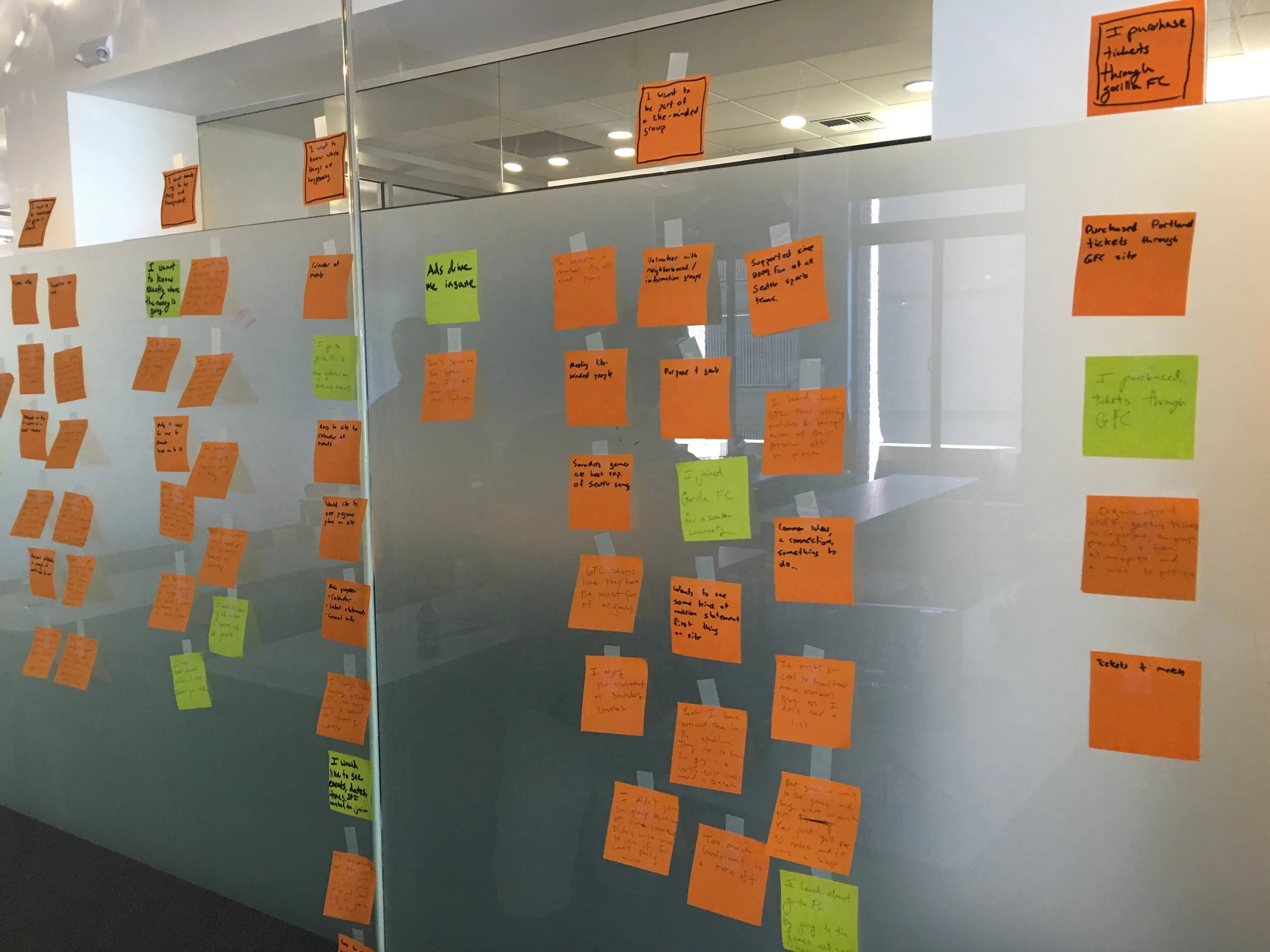
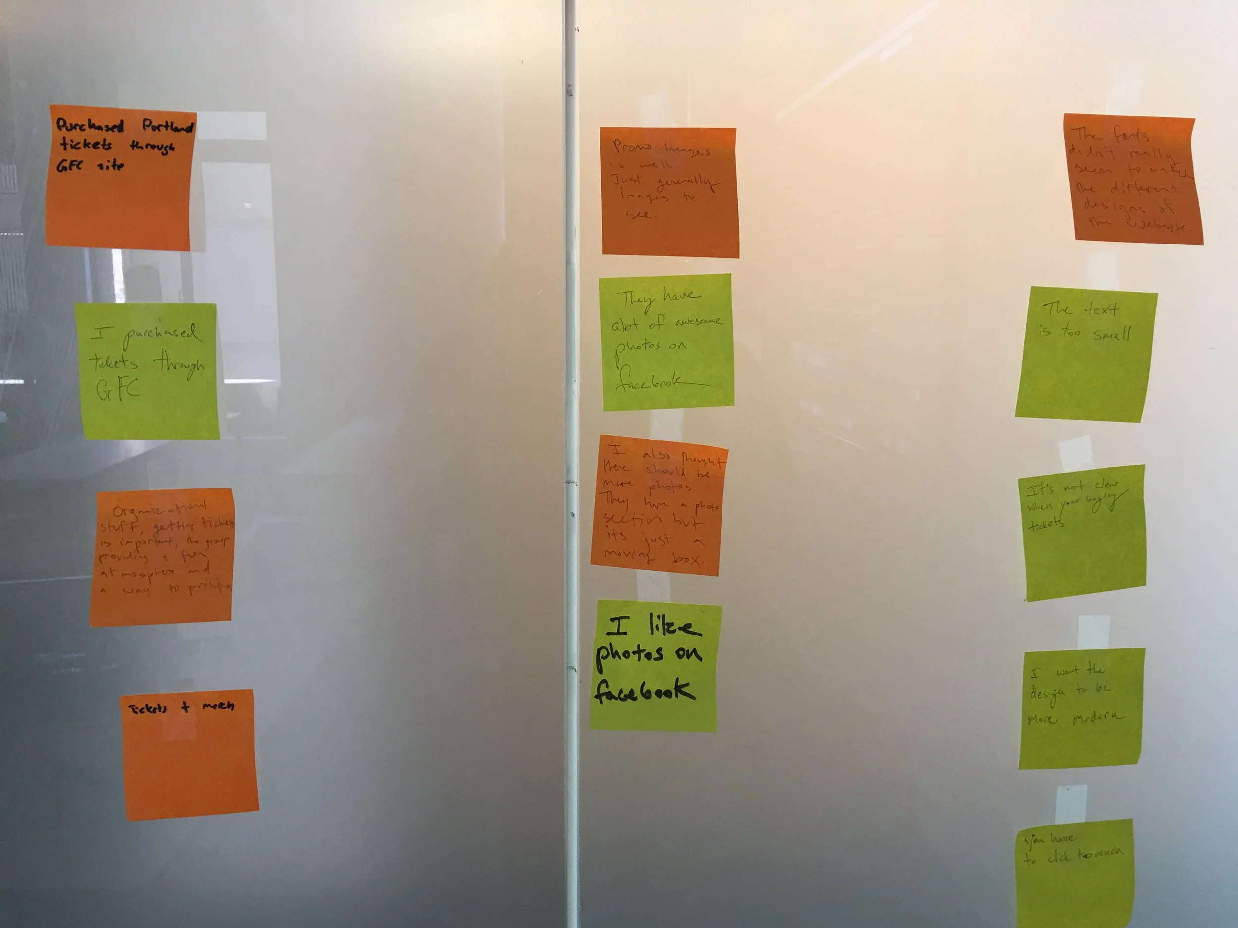
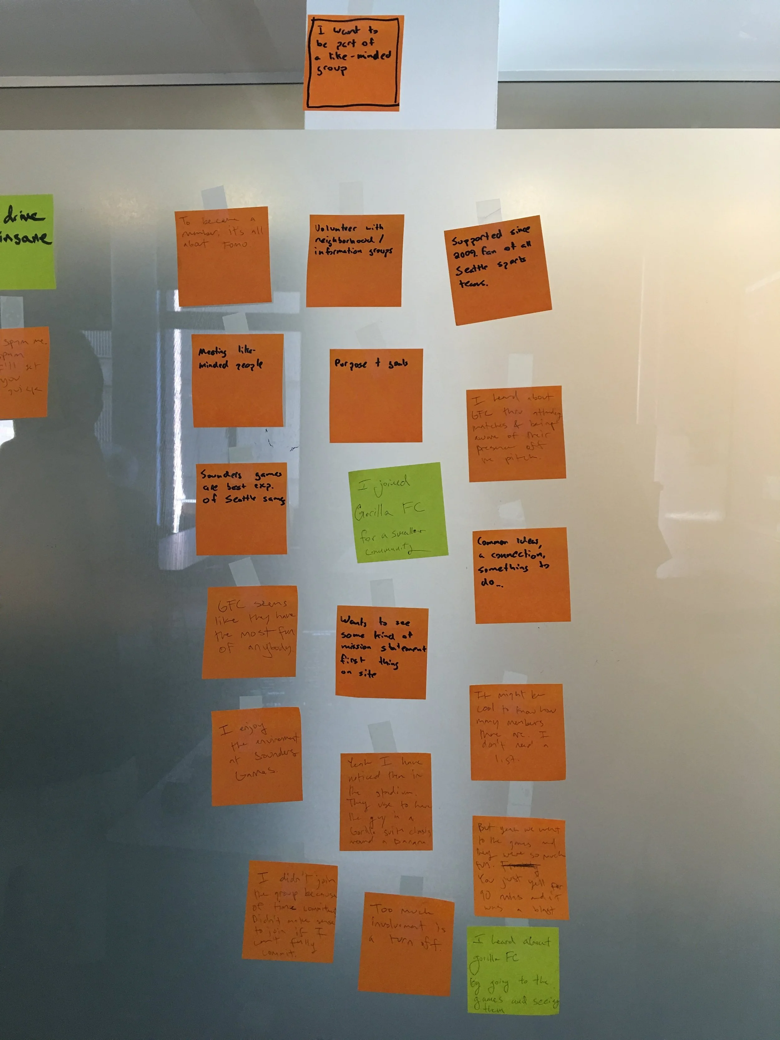
After interviewing the subjects over the phone, we used the interview logs to form an affinity diagram. By melding the quotations from both interview scripts into common trends, we were able to discover what was important to both current and potential GFC members.
Donating
Donating turned out to be a huge pain point. This was true not only for the Gorilla FC members we interviewed, but also for a few potential members who heard about Gorilla FC and unsuccessfully attempted to donate. To understand what was so difficult about it, I constructed a task analysis to see how the donating process played out. I discovered that it was an ambiguous process to donate. Even after mapping out the process, I wasn't really sure where the money was going. So I contacted the leader of GFC and asked him if he could clarify:
"People can donate three different ways through our website: choose one of our partner charities to donate directly to; buy our merchandise; or purchase a rec soccer membership."
I now knew that people were detered from donating because they couldn't simply give money directly to the GFC through their website. They had to purchase something, and it wasn't specified as to what percentage of that money was going towards charity.
Proto-Personas
We used trends from the affinity diagrams to construct two Proto-Personas: Francis and Janet. These two comprised the strongest reoccurring trends that echoed throughout all of the people we had interviewed. They were used to help design an experience that would cater to our target markets as closely as possible. The experience is defined through a User Journey Map.
User journey map for Francis
Information Architecture
It was time to organize our research into applicable design. We made a site map that outlined how the content needed to be emphasized, organized, and presented. With the help of some additional card sorts, we organized the rest of the information under these categories.
Interface Design
The new interface we designed tackled the largest road blocks which were stopping Gorilla FC from flourishing.
Donating and becoming a member: The new HOME interface features a newly structured visual hierarchy. It includes a strong call to action button for both donating and becoming a member. These processes were also made possible through the website and significantly simplified.
The Spirit of GFC: It was discovered through research that potential members wanted to see the Gorilla FC in action. Though GFC has many social media outlets, they are spread throughout the internet and difficult to find. The new interface includes a page where social media threads can be seen and interacted with directly through their website. Now the Gorilla FC story can be told without having to navigate offsite.
The donating process was simplified into one easy step.
Usability testing
After the site was created, we began testing it with users. We gave them several tasks to accomplish:
Donate directly to the Gorilla FC.
Become a member of the Gorilla FC.
The suggestions were useful and throughout the testing we tweaked the website until both of these tasks were as simple as possible. The usability testing was enlightening in the sense that it revealed different routes people took to donate. For example, one of the more enthused subjects first navigated the website when asked to donate. He discovered that he would rather donate by buying one of GFC's hats, while also donating directly. So in the redesign, we made the option to donate directly the equivalent of an item in a shopping cart. This way users could simultaneously do both.