
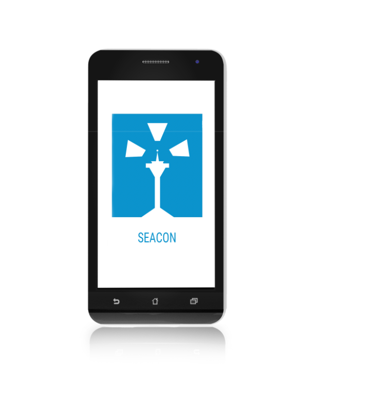
Seacon project
I designed an android application for Seattle.gov. The application was intended to help Seattle residents prepare for earthquakes.
Research
In order to gather research, I interviewed civilians of Seattle. What they did to prepare, what they did not do, what they wish they knew how to do, etc. This required a few steps of preparation to assure we attained the optimum results. First, I conducted a competitive analysis to understand what other emergency preparedness mobile apps were doing to prepare their users. We used this information to really structure our interview scripts. Then, we constructed a screener to target different types of Seattle residents. We focused on sending the screener to a broad and diverse market so that we could learn how different people approached earthquake preparedness. After narrowing it down to the perfect sample of Seattle citizens representing our target market, we then conducted our interviews.
The Affinity Diagram above was constructed from common quotes we pulled from our user interview logs. We organized the quotes into trends which helped us pinpoint what the majority of the interviewees experienced.
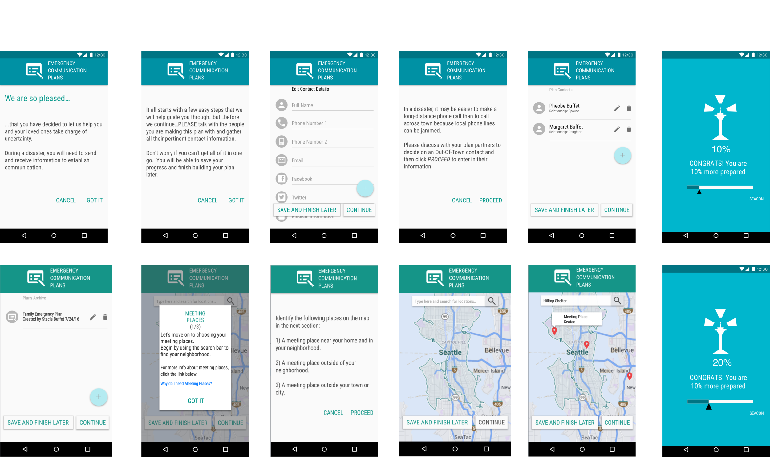
One trend that we identified was that people would often stop preparing themselves because the actual thought of being unprepared caused them a lot of stress. One of the quotes in this trend states:
"It seems as though becoming prepared is a fruitless venture. When you prepare yourself in one way, five more things your have to do sprout out of the wood work. So you don't really know how long its going to take or if you're really making any solid progress."
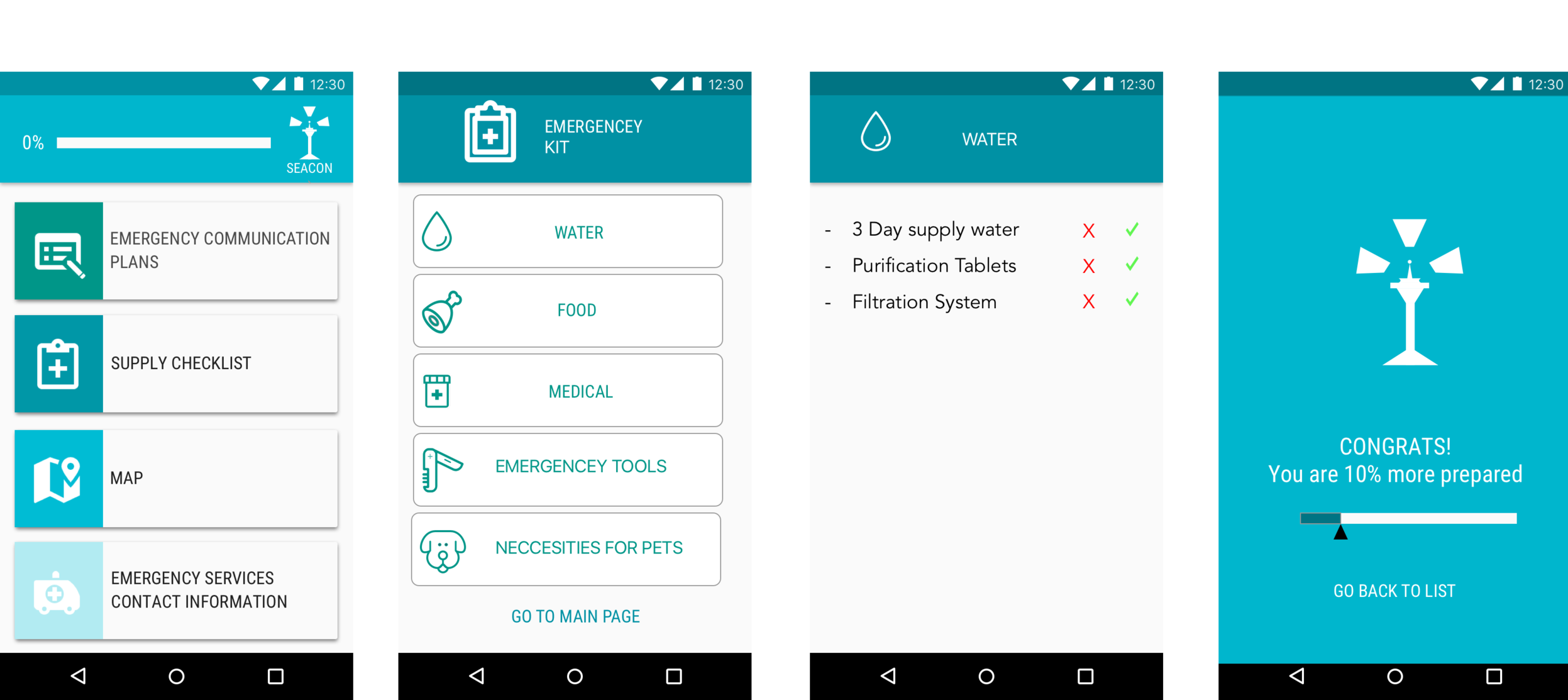
We incorporated this into our design later by including features to combat the feeling of being overwhelmed. One of the features that we had designed was a reward screen that was meant to give the user a sense of progress after completing a task.

Proto-Persona
Stacie, one of our proto-personas, was interested in accomplishing certain goals while becoming prepared. These goals were common with the majority of the users that we interviewed. By applying her goals and wishes to a user journey map, we targeted how we could make Stacie's experience as pleasant as possible.
Proto-persona
A user journey map on how Stacie would use Seattle.gov's website.
Information Architecture
Our team narrowed down the most important content that needed to be included in the app. We then made a site map on these features to help us visualize how they could be organized. This organization was assisted by issuing card sorts to participants. These card sorts gave us perspective on how potential users would intuitively navigate the application to find what they needed.
User Interface Design
Now that we had a plan, it was time to design what the UI would look like. For me, this included low fidelity wireframes, a style guide, and a fresh new logo.
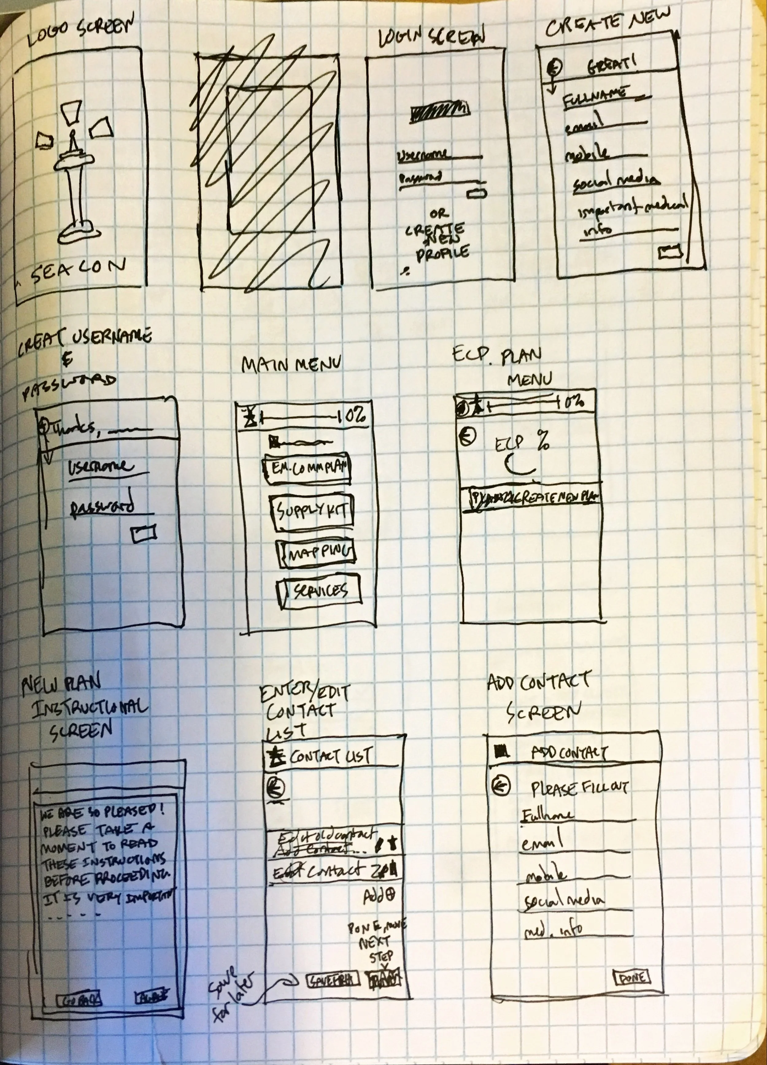
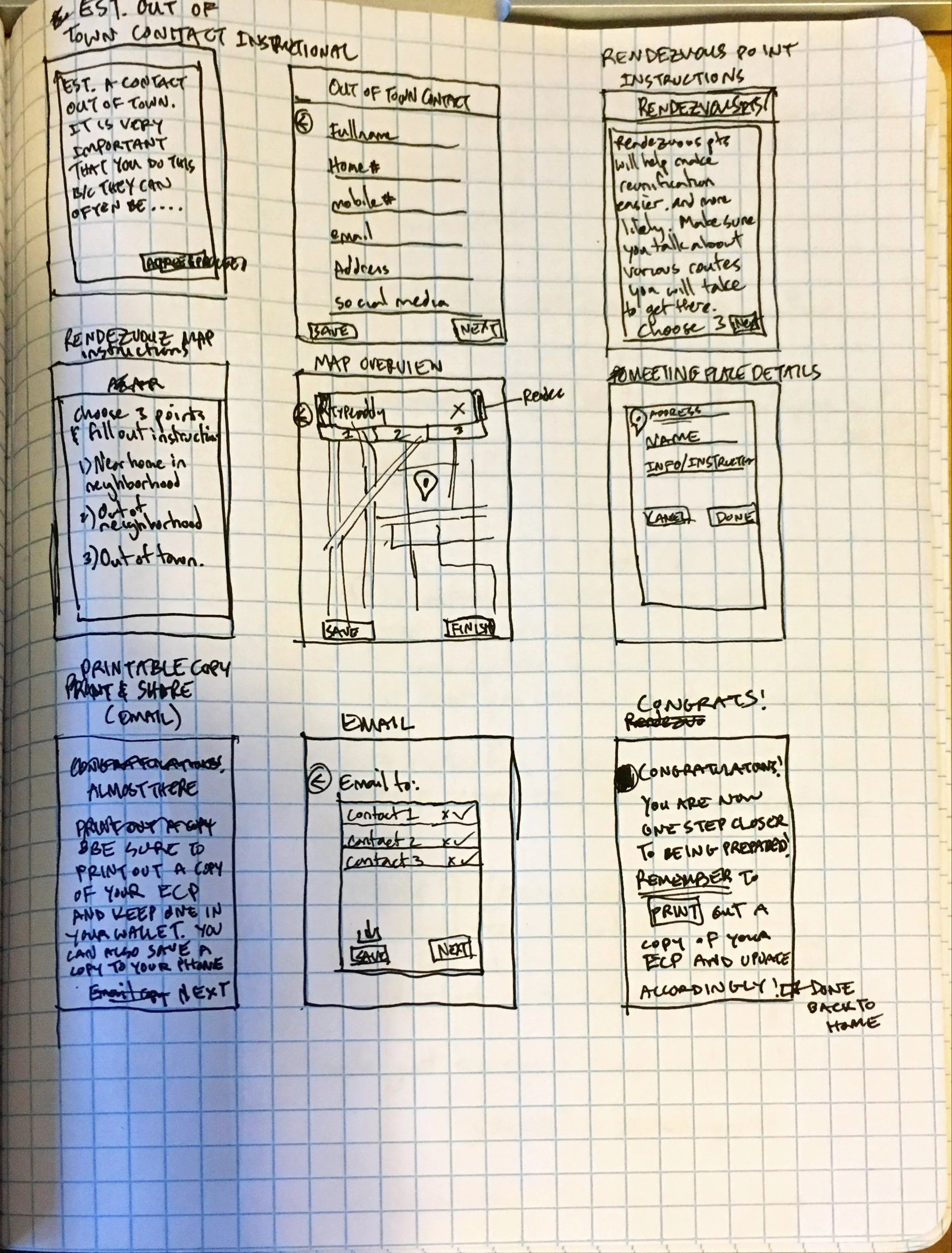

Prototyping
Finally, my team and I came to the prototyping process. We took the previously sketched low fidelity wireframes and turned them into pixel perfect UI screens. From these screens, we collaboratively built our Axure prototype.
Usability Testing
After creating a usable Axure prototype, we began our usability testing. Testing occurred onsite with the same subjects we interviewed earlier. We first gave them a task, and then carefully observed while they made their way through the application. We asked them to be very vocal about their thought process, confusions, likes, and dislikes. We then recorded this audio while also taking notes in order to discern where this audio applied. Usability testing taught us a lot about how the user preferred to undergo the emergency preparation process. We learned that the more guidance through the process, coupled with in depth explanation of why this preparation was necessary, resulted in a greater chance that the user would actually prepare themselves happily. From these findings, we made our final redesigns and presented it to the stakeholder.