Accenture
customer-facing e-commerce website
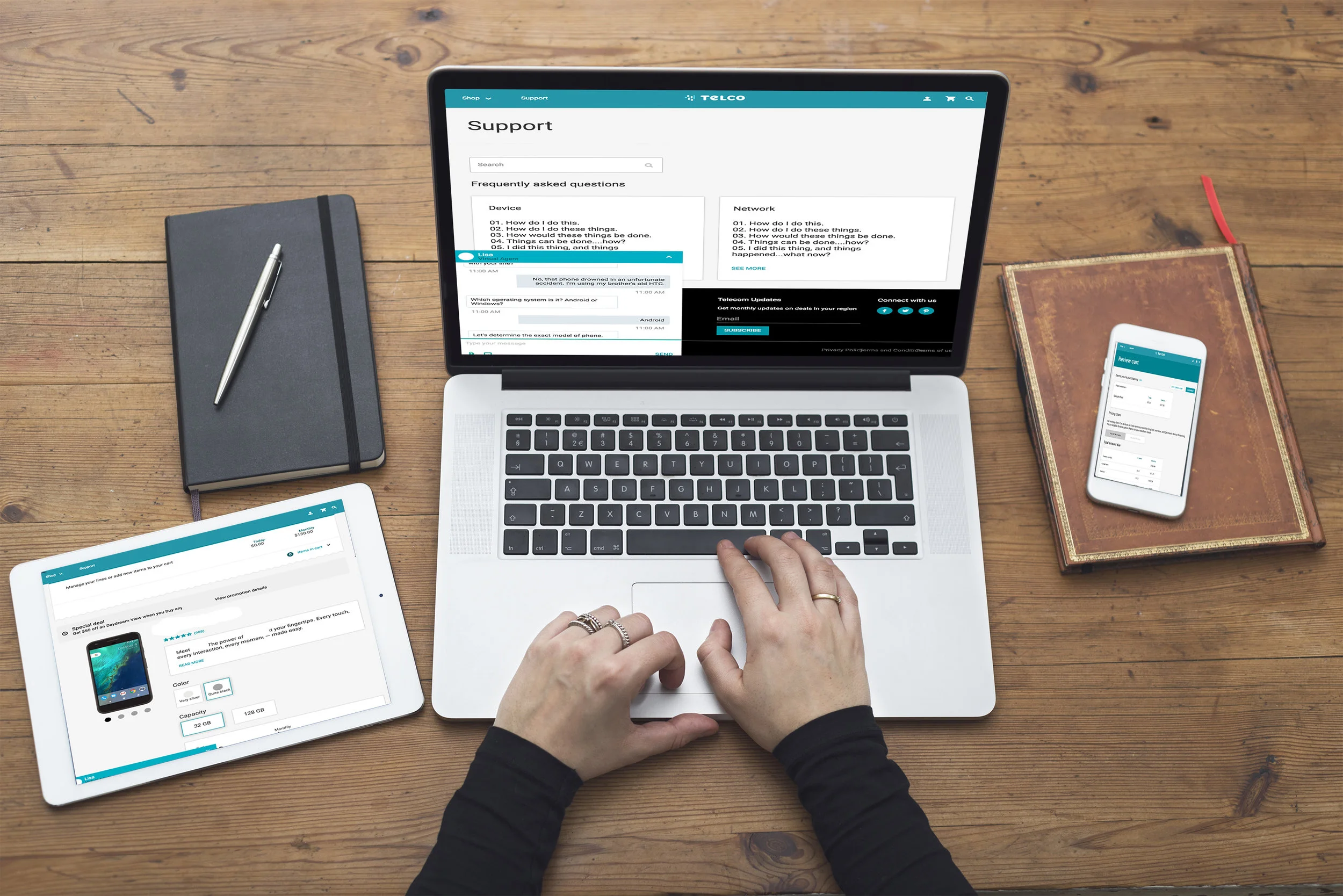
Accenture’s client, a small telecom company, had requested a redesign of their website’s account landing page. They wanted us to do so by updating the site with modern material design elements. The secondary goal was to include these elements in an online style guide to be passed to future designers and developers in order to eventually be incorporated site-wide.
(Due to NDA, the amount of material that I am able to show is very limited. The wireframes that are shown are not the final iteration)
Account Landing Page
ONLINE SHOPPING
User Experience Design
Along with the UI Redesign, we were also to find ways that the customer flow could improve for two parts of the website: The account landing page and the online shopping.
For the Account Landing Page, we used customer research in order to figure out what was most important to the customer. This lead me to my task of organizing the data in an intuitive way that was friendly to the user’s cognitive load. We also needed to find a way to make it accessibly friendly to color-blind people. My design solution was to add visual patterns to the data visualization segments in the user’s Data Usage. That way, a user could read the data usage accurately without color, and also pair each data segment with the corresponding family plan below. The Account Landing Page wireframe above shows an earlier iteration without the visual patterns.
The online shopping needed a way to upsell products that were actually relevant to the user. My contribution was the invention and design of the featured accessories page. This segment drew its information from the customer’s online portfolio that had been previously accumulated through the user’s usage history. This profile included information about items that the user had previously bought or currently owned. It also incorporated information gathered for the user’s interaction from the artificial intelligence chat bot (Which we’ll talk more about next).
Artificially Intelligent
Customer Facing
Chat Bot
The client was looking to incorporate an artificial intelligence chat bot to their website. Our task was to visually distinguish what the UI of the chatbot would incorporate on the customer facing end, as well as the customer service facing end.
Lo- to High Fidelity wireframes of the AI Chatbot
Although we agreed that the AI should be used for mainly customer service purposes, we also saw an opportunity to up-sell the customers when appropriate. That being said, it was important to our team that the AI wouldn't become an advertising nuisance. To avoid the AI becoming a smarter (and more expensive) version of a pop-up ad, we had to decide how and when the AI would interact with the customer if not first prompted.
This flow chart was conceptualized based on the customer profile. For instance, if the user had a family and was not signed up for a family plan, then the chatbot would pop up suggesting a family plan. However, the AI chat could only pop up to suggest a family plan if the customer was on the page dedicated to data plans.
Similarly, if the customer was on the landing page for phone sales, the AI chatbot would suggest phones that could be a good fit for the customer
Artificially Intelligent
Customer service representative Facing
Chat Bot
After we delivered those designs, my peer and I were paired with the Fjord Design team of Seattle to help tackle another design problem. We had received a research that our client’s customer service representatives were having trouble. One of the issues that the CPR's were having was that they were unable to see the screen of the customer that they were helping. This often lead to longer and more frustrating conversations. Our solution was to take all of the tools from the previous CPR platform, and then put them into a collapsable toolbar fixed to the bottom of the CPR's screen. With this design solution, the CPR could collapse their tools to have a full view of their customer’s screen at will. We prioritized our taxonomy of the toolbar based on the tools that were used most often.


